Create graphs and diagrams with OTEA
This module, more intuitive and customizable than ever, is a key part of OTEA’s analysis tools. Next, we explain why.
Answer important questions
To perform exceptional analysis, it is not enough to be able to make graphs, you also need to have powerful tools prepared to work with the data. Saving graphs, hiding variables, adding and subtracting values, comparing variables from different machines or comparing axes are some of the features of this new module that will help you detect trends, identify errors and make decisions based on reliable data.
We give you a practical example. If you need to control the defrost process of a machine that has given you problems, just create a weekly dynamic graph. This way, you can check daily if the stages are working correctly or anticipate possible energy cost overruns and breakdowns.

Set up graphs step by step without having to program
OTEA accompanies you in the creation of each new graph so that you do not have to formulate operations and decide step by step what you want to know.
You can choose between two types of graphs: time lines and accumulated graph. And, this is what you can do with each of them:
Timelines
These graphs, whose data can be grouped by: days, weeks or months, allow you to compare the evolution of one or more variables, over 24 hours, in a specific time interval.
This means that OTEA will guide you to configure a graph that shows a daily line with the evolution of power over 24 hours, in case in an installation you want to compare the consumption peaks of the last 7 days on a daily basis.

One of the biggest advantages of timelines is being able to create them as dynamic charts. By configuring them once, you have a very powerful tool that automatically updates the progress of your data during the last days, weeks or months.
If what you need is to analyse the data in a static interval, during the first semester, for example, you can also do it. If you save it, it will always be available for you to check the status of a machine or installation in a specific time frame.
Accumulated graphs
These graphs allow you to compare variables of different installations in a specific time interval.
Thus, you can build graphs with OTEA that compare the energy consumption of an installation by hours, days, weeks, months or years with respect to different time intervals.
In addition, by adding different variables, such as the active energy of the climate or cold machines, you will see at a glance which equipment consumes the most.

In the accumulated graphs you can also perform operations (additions and subtractions) between the different variables. As a result, you will obtain accumulated graphs or graphs that show the differences between consumptions.
Customize the graphs: filter and choose the colour, shape or style of the data display
This new module has different display options for you to adjust the way data is shown in a graph.
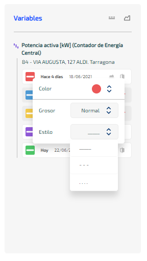
Colours and style: Modify the colour, thickness or style of the line or bar of a graph to your liking.

And if you can’t find what you like among the available colours, you can add a hexadecimal colour or use the eyedropper to copy the exact tone you’re looking for.
View variables as an area: view different variables in area format to compare data more easily.

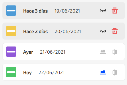
Hide or delete variables: click on each variable to temporarily hide them. The ones you hide will be marked in grey. If a variable does not provide you with valuable information, you can delete it by selecting the red cube.

Confront Axes: Confront variables to create two different reference scales for displayed values. This way you can easily see how the trends of two series interact. We recommend that you use this functionality with timeline charts.
Start now
If you want to analyse energy and water consumption, use our API to integrate it into a project or if you have any questions, leave us your information details and we will contact you as soon as possible.

